BLAZON
Argent an open Book garnished Gules clasps and buckles Or thereon inscribed the words SICUT SERPENTES SICUT COLUMBAE between three crosses pattée of the second on a Chief of the last a Key in bend sinister of the first surmounted by a similar Key in bend dexter Gold between to the dexter a Serpent knowed and erect and to the sinister a Dove both proper

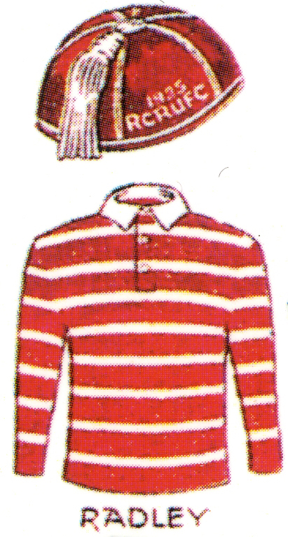 Radley Rugby Club colours, 1925
|
|
|
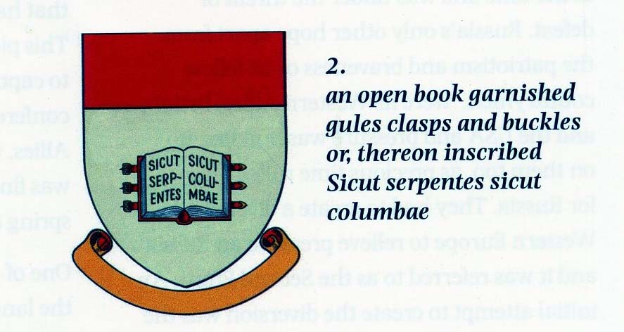
2. An open book garnished gules clasps and buckles or. On the silver part of the shield is depicted an open book decorated with red clasps and gold buckles. The open book symbolises learning and reflects the heraldic device of Oxford University. The clasps and buckles are taken from medieval books which were clasped/locked shut to protect the contents from dust, and an opened book symbolises access to learning. Inscribed thereon Sicut serpentes sicut columbae. This is the motto of the school. It is written on the open book in acknowledgement of the role Oxford University played as a model for the school. |
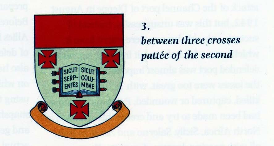
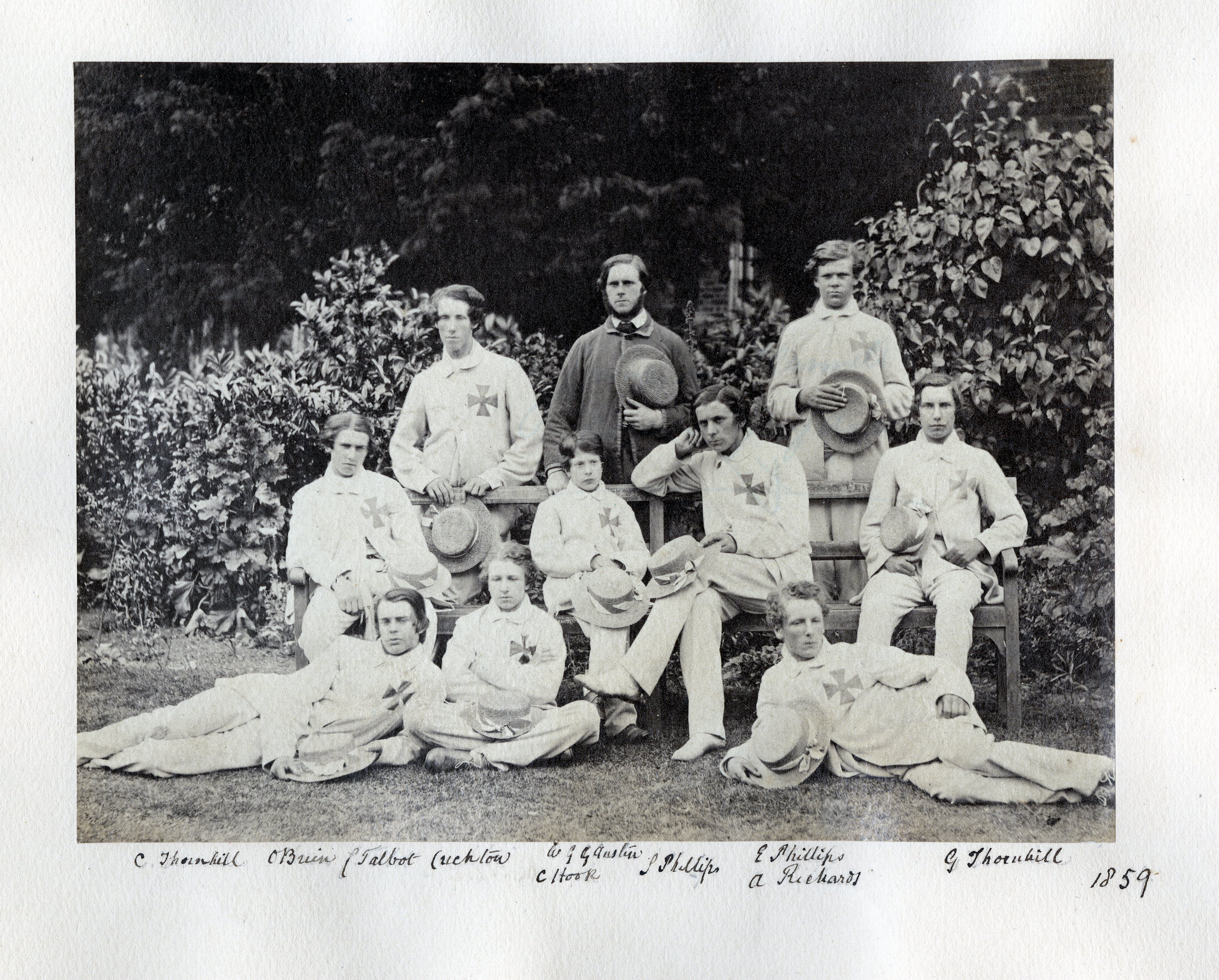
3. between three crosses pattee of the second. The open book is surrounded by three red crosses pattee, more commonly called Maltese crosses. The Maltese cross was originally adopted by the College as a badge for all sports. It appears on a tankard awarded to Edward Kennard for Senior Athletics in 1858/9.
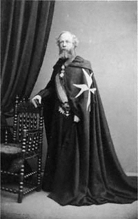
It became the symbol of the Boat Club from the earliest known crew and has continued in use by them ever since. It was probably adopted in honour of Sir George Bowyer, the owner of Radley Hall and from whom the house and grounds were rented when the school was founded in 1847. Bowyer was created a Knight of Justice of the Order of Malta and a Knight Grand Cross of the Order of St. Gregory the Great in the early 1850s. His portrait in the National Portrait Gallery shows him wearing the robes of the Order decorated with the cross.
|
|||||
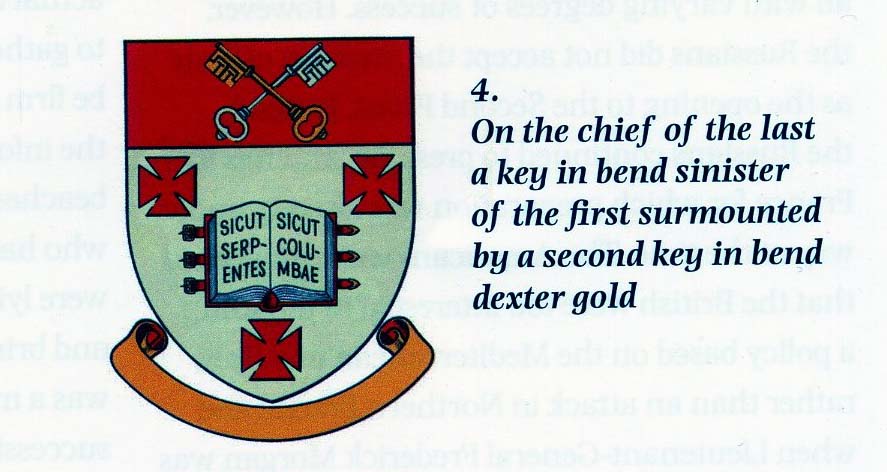
4. On the chief of the last a key in bend sinister of the first surmounted by a second key in bend dexter gold. On the upper red band are depicted the crossed keys of St Peter, the lower pointing left in silver, the upper pointing right in gold. From its very foundation the College was named and dedicated to St Peter and is formally called St Peter’s College, Radley. William Sewell and Robert Singleton the co-founders and first Warden, referred to their pupils as Petreians rather than Radleians, although the term Radleian was in common usage from at least 1855. The term Petreian has been used from time to time, mostly for a magazine in the 1930s. The founders dedicated their College to St Peter because they considered that there was (in 1847) no other St Peter’s College in Great Britain. The bell they had cast for the bell tower was named Great Peter for this reason. The crossed keys on the crest caused anxiety when the 1908 design was first revealed to the school. Strict laws of heraldry stipulate colour on metal (as above argent/gules) never metal on metal or colour on colour. The two metal keys, gold on silver, seemed to break this rule. A letter to the Radleian in June 1908 states this worry: I believe I am right in saying that one of the most rudimentary laws of Heraldry has been transgressed in this new design, i,e., that .” metal cannot be placed upon metal or colour upon colour.”[Boutell’s English Heraldry, p. 15.] Would it not be better to make sure that no such error be made before a crest be introduced which will render the existing dies, etc., valueless, on the plea of their not being correctly emblazoned? Answer from the Editor: Cross-keys arc an exception to this law.- ED. In 1914, a note in the Radleian suggested that the crest be used on College stationery, implying that even at that early date it was still not being used. The crossed keys were adopted as a badge for school sports and stationery in 2016.
|


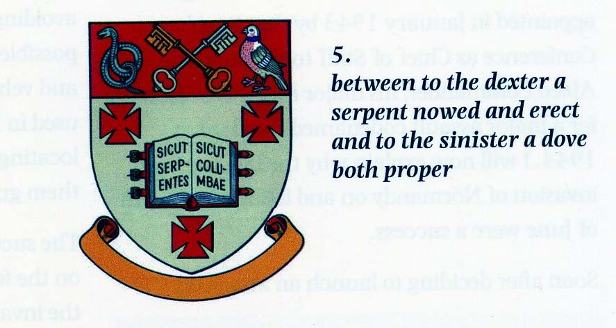
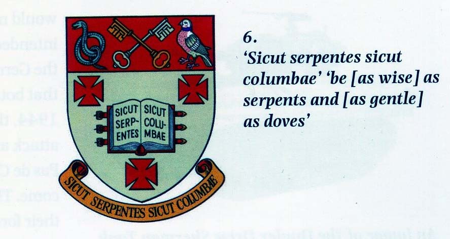
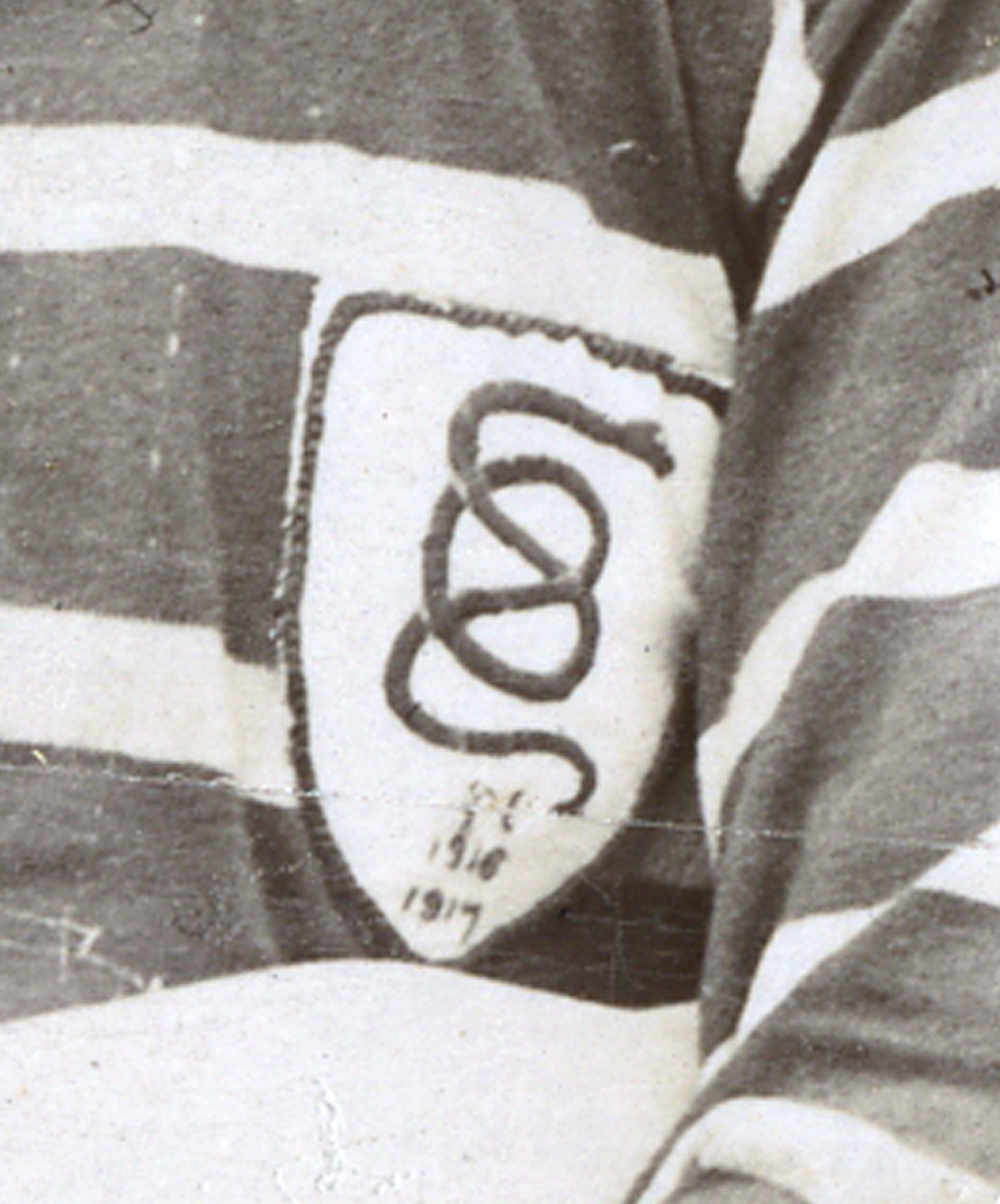
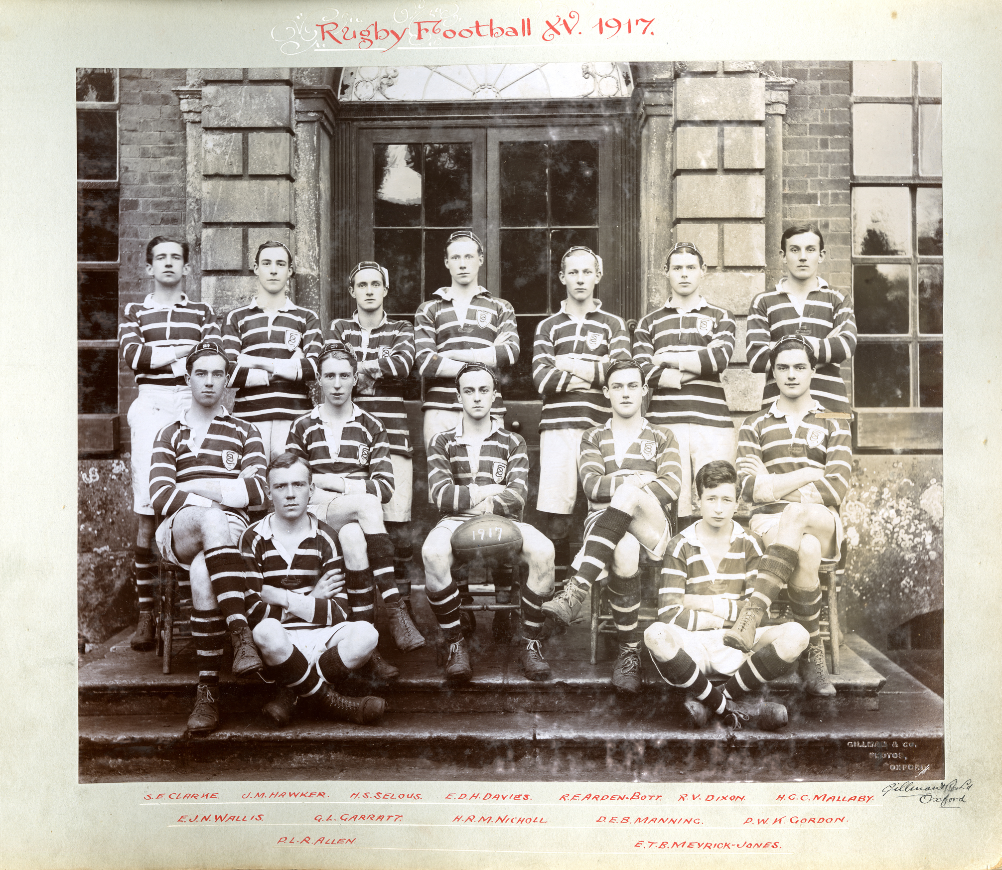
5. Between to the dexter a serpent nowed and erect and to the sinister a dove both proper. To the right of the crossed keys is a knotted serpent standing up on his tail, and to the left a dove. Both are shown as though they are painted in their natural colours, rather than heraldic colours. The serpent and the dove were the symbols of Radley College from its foundation. The Latin motto ‘sicut serpentes sicut columbae’ was adopted by William Sewell not just because these were the characteristics he hoped his pupils would develop, but as a Latin pun on his other foundation, St Columba’s in Ireland. The motto comes from Matthew 10:16 ‘Behold, I send you forth as sheep in the midst of wolves: be ye therefore wise as serpents, and harmless as doves.’ The serpent was adopted as the badge of the Rugby Club when it was founded in 1914, but first appears on shirts in the team photo for 1917. At the Centenary in 2014 the 1st XV re-created the same badge to wear in memory of those earliest Radley players, many of whom fell in WW1.
|
|||
6. The motto is associated with the shield but can be used separately from it, or the shield used without it. |
The crest awarded by the College of Heralds in 1908 incorporated, therefore, a number of elements that had become a part of Radley’s identity since its foundation. It is relatively straightforward, with each element clearly conveying the ideals of Radley. However, it is not the first coat of arms used by the College. An Oxford tradesman certainly made and sold spurious Radley College crests from the 1860s which were still available for Radleians to buy in 1901 when it was described in the Radleian:
THE RADLEY ARMS.
It is most difficult to discover who was responsible for the composition of the Radley Arms. Mr. Raikes in “Fifty Years of Radley” ascribes their origin to an Oxford tradesman of about the year 1867, others assert that it is lost in antiquity; perhaps it is better so. The arms have been simply adopted, without any attempt whatsoever to get a formal grant from the College of Heralds. It is certainly much easier for a corporation possessing a Royal Charter to obtain a grant than it is for a private individual, but the College of Arms is the official head of Heraldry in England, and by it alone can arms be granted. Arms were granted to Eton College as early as 1449. The adopted Radley Arms would, I believe, be described as follows: argent, on a chief sable an eagle’s head erased issuant from a ducal coronet or, between two hawks volant of the same, in base a Maltese cross gules. The cross is popularly supposed to be a Maltese cross, but it is always drawn as a cross patee. The hawks are taken from the Stonehouse arms, the eagle’s head from the Hubbard crest, and the coronet from the Bowyer crest; but in all these cases a proper difference has been made by the colours and positions being entirely changed. The arms themselves, though not beautiful, are quite possible. It is the usual custom in granting arms to a town or college to make them resemble in some way the arms of families who have been connected with them. It would be hardly possible however to confuse the Radley arms with those of the Stonehouses, nor indeed of any family under the sun .
This describes a silver shield with a black band at the top; on the black band a gold eagle’s head rising through a coronet, with two gold flying hawks on either side of it; on the silver part, a red Maltese cross. The Stonhouse family owned the estate at Radley from the 16th-18th centuries and were responsible for building the Mansion. The Bowyer family inherited the Radley estate from the Stonhouses, and leased the house and grounds to Radley College. John Hubbard, MP, later Lord Addington, was one of the earliest parents at the school, and was responsible for saving it from financial disaster in the 1850s – he is considered the school’s greatest benefactor, his portrait still hangs in Hall. So this invented crest represented several of the people associated with the school and the estate, but none of the ideals of the founders. The only part to survive in the Grant of Arms awarded in 1908 was the Maltese cross of Sir George Bowyer.
That the crest was spurious did not deter a suggestion made in 1867 that the Cricket XI needed a badge of their own. This letter in the Radleian signed ‘Another Reformer’ suggests that the crossed-keys could be used for cricket, presumably to echo the Maltese cross being used by the Boat Club:
I wish to bring to the notice of the School in general, a point which has for some time past suggested itself to me and also to other members of the School, namely, the plainness of the First Eleven’s’ uniform. This defect might easily be remedied by the embroidering of some little device on the breast of the coat. St. Peter’s keys, or even the College crest, would not be at all in-appropriate, and would certainly improve the appearance of the uniform. Editor’s reply: [The matter had full consideration last season; and we believe the present uniform was considered quite satisfactory.-Ed.] The Radleian, April 1867
Change was being complained about in 1889 when the design of the Radleian changed and its logo which showed the earliest design for the College seal was replaced by a badge of the serpent and the dove. The seal was designed by Edward Howard, one of the first Fellows of the College. (He also designed Clock Tower). It was probably used as the first bookplate for items in the Library and still exists on some books in the Rare Books Collection:
 Howard’s design for a College seal showing St Peter |
 Bookbinding from Sewell’s earliest school library |
For my part I never liked the old block of St. Peter, and am very glad to see that it has been superseded; but how is it that the School arms have not taken its place? Unless I am very much mistaken, the Dove and the Serpent form the crest only; the arms of course everyone knows. There are but few schools that have as good arms as we have, yet I should say that ours were the least seen of any. While on this subject, how is it that they do not appear on the School prizes? We possess arms, why then should we not make use of them? Have both them and the crest if necessary; but if we may have only one, by all means let it be the former. The Radleian March 1889.
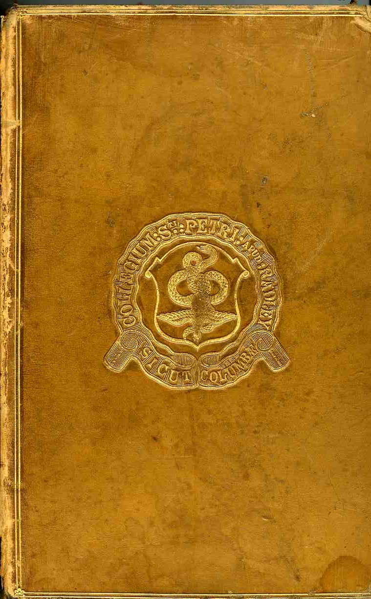
Of course, the arms he is arguing for so vehemently were technically illegal. The crest, however, was not a new design in 1889, but actually dated back to William Sewell’s earliest days at Radley when it was used as a stamp on the covers of books in the College library. A few examples still survive. It dates from at least 1853 and is the earliest representation at Radley of the serpent and the dove, reinforcing the point that this motto was chosen by the founder himself. The Sewellian design shows the dove engulfed by the serpent, however, the motto has been reduced to read ‘sicut columbae’ – was Sewell more concerned that his boys be gentle as doves than that they be wise as serpents? or was he emphasising the pun on St Columba’s, his earlier foundation in Ireland?
The cross keys of St Peter and the serpent and dove were both in use on official school objects, unlike the spurious coat of arms invented by the Oxford tradesman, and both were incorporated into the 1908 Grant of Arms. Both were incorporated into a bookplate designed for the Wilson Library when it was founded in 1897, which can be compared with the bookplate designed for the re-founded Wilson Library in 1925, after the official arms were granted:
 Wilson Library bookplate 1897 |
 Wilson Library bookplate 1925 |
The 1925 bookplate shows the variation in execution which is possible in heraldry. Every element of the shield is there with the exception of the motto, but each is markedly different from Escott’s depiction in 1964 which is beautifully understated. It is a function of heraldry that both the whole and each individual part represents Radley College: sicut serpentes sicut columbae.

Radley College crest. From an original engraving by Dan Escott, commissioned by the Heraldry Society in 1964
Clare Sargent, June 2017
The ‘parts of the shield’ designed by Mike Brain and published in The Radleian 2008 to celebrate the Centenary of the Grant of Arms
